Optimize Website Content Organization to Support Youth Entrepreneurship
Cambio labs, a non-profit organization, supports youth entrepreneurship in NYC by enhancing user engagement through optimized website content organization.

Roles
UX designer
UI designer
UX researcher
Tools Used
Miro
Figma
Notion
Google meet
Chat GPT
Time line
8 weeks
Client
Cambio labs, NYC
Overview
As a designer passionate about contributing my design expertise to the community and those in need, I decided to volunteer as a solo designer for a website redesign project in the summer of 2023, following the completion of my design boot camp. This project not only allowed me to refine my design skills but also gave me a chance to practice my UX research planning to develop a new website concept for Cambio Labs, a nonprofit organization. The redesign focused on enhancing their website to support the launch of their new education program, which promotes youth entrepreneurship in NYC. Through this project, I gained valuable experience in client communication, learning to convey ideas more clearly and concisely to help drive their success forward.
Sneak peek
Enhancing user engagement through optimized website content organization.
Cambio Labs’ redesigned website embraces modern design trends, delivering not only a visually appealing experience but also enhancing user engagement through an intuitive call to action. It effectively communicates the client’s mission and vision, creating a meaningful connection with users.

About client
Cambiolabs, a non-profit organization in NYC creates educational technology and curricular programs that transform students into social entrepreneurs, designers for impact, and community activists. They are planning to launch a 12-week new pilot program in 2023-2024 that focuses on empowering students’ entrepreneurship through collaborating and analyzing social issues together.
Problems
Disorganized content information within the existing website hinders the website users from completing their goals effectively and it leads to an impediment in promoting the organization. The website is urgently required to be redesigned in an aspect of both UI and UX.
Project goals
Cambiolabs wants to redo its website design to be visually appealing as well as more structured with content to cater to the potential sponsorship in advance to launch the social entrepreneurship business development resources program, Startup NYCHA.
Solutions
After discussing this with a client, I understood that the existing website requires a fashioned content organization to enhance user experience with appropriate CTA incorporation. Also, as the client wants to initiate a new program that targets potential sponsorship, the web design should incorporate a modern, visually appealing one that captures the attention of users by following the brand guidelines provided by the client.
- Incorporating a user-friendly CTA.
- Develop a new content organization to enhance user experience.
- Incorporate a modern, user-friendly visual design that introduces their new program, Startup NYCHA most effectively following the brand guidelines provided by the client.
Final results
Before & After
1. Enhancing Visual Hierarchy
The visual hierarchy between titles and body content has improved. Additionally, I incorporated high-quality images that effectively convey the organization’s programs and mission, guiding users toward key actions such as becoming a partner, making a donation, or learning more.
Final results
Before & After
2. Incorporating Numerical Data
A new section highlighting the organization’s success and impact through real data has been added. This strengthens credibility and builds trust with users by showcasing measurable achievements.
3. Leveraging Testimonials
Testimonials foster an emotional connection with users, making the organization’s mission more relatable. This, in turn, encourages greater user engagement and involvement.
Research
Identify the goals and motivations through communication with a client
Before the meeting started with the client, I prepared the questions so that I can identify their clear goals for the redesign, target users and visual preferences.. In that way, I was able to direct the project within the desired scope as the client wanted.

Research
Competitive analysis
To identify the opportunities by understanding competitors’ strengths and weaknesses as well as market strategy for the website design, I analyzed the direct and indirect competitors with the following criteria.


Research
Current website analysis
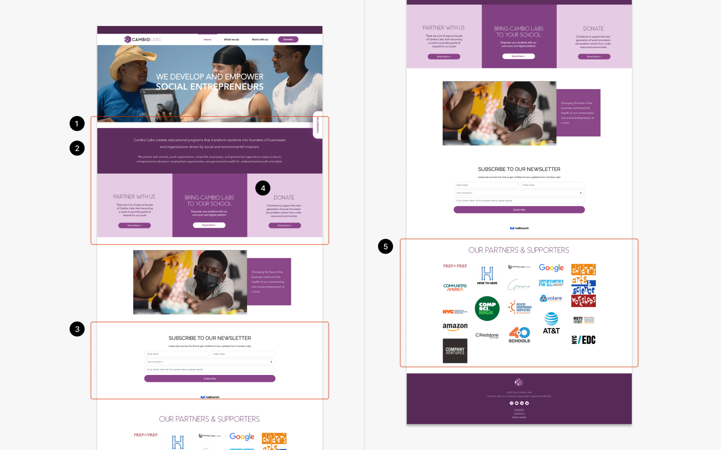
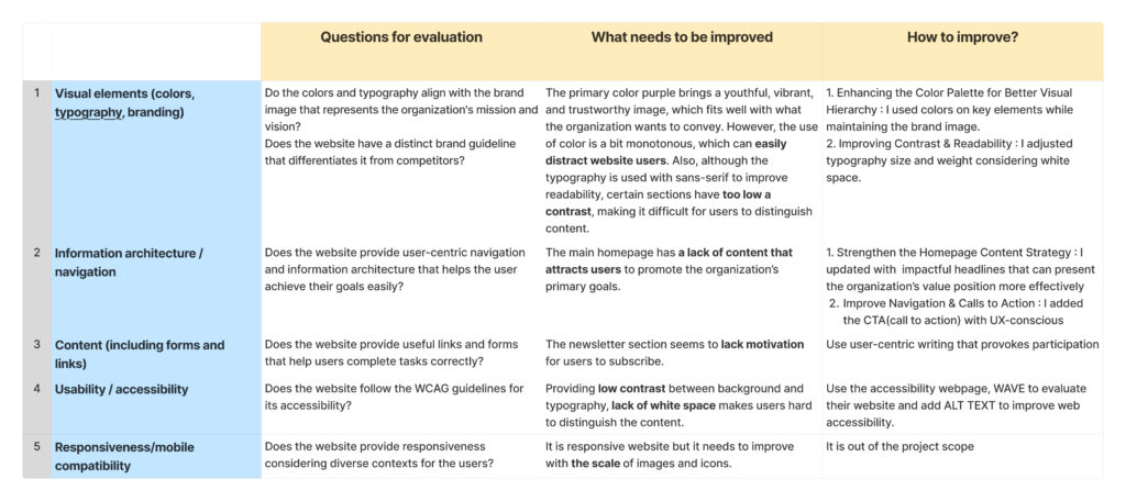
Before I began the redesign process, I analyzed the existing website design using the following factors to identify the areas that required updating.
- Visual elements (colors, typography, branding)
- Information architecture and navigation
- Content (including forms and links)
- Usability and accessibility
- Responsiveness/mobile compatibility
Research Key Findings
Incorporate integrated CTA(call to action) along with organized content are required to accelerate user engagement
Based on both primary and secondary research, I identified key insights to enhance my design process. Incorporating numerical data to showcase business success is essential for building audience trust. Also, improving visual hierarchy is crucial to communicating the organization’s mission and vision efficiently. Lastly, creating an impactful headline that urges users’ action within the website is essential to boost user engagement.

Numerical data
Use numerical data is important to verify their business and build trust in audience

Improve visual hierarchy
To help users find the information easily by improving reliability, and highlighting the information.

Impactful headline
Using impactful headlines that align well with the organization’s values can lead to user engagement.
Understanding users
Discovering target users' motivations and painpoints
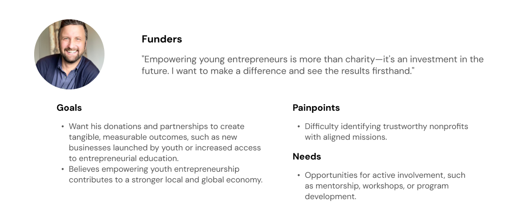
Based on the meeting with a client and secondary research on the existing website, I have identified two categories of target users. first, funders who want to be a parter with Cambiolabs by donating and supporting. second, volunteers who want to contribute to society by mentoring and tutoring.

Ideate
MOSCOW
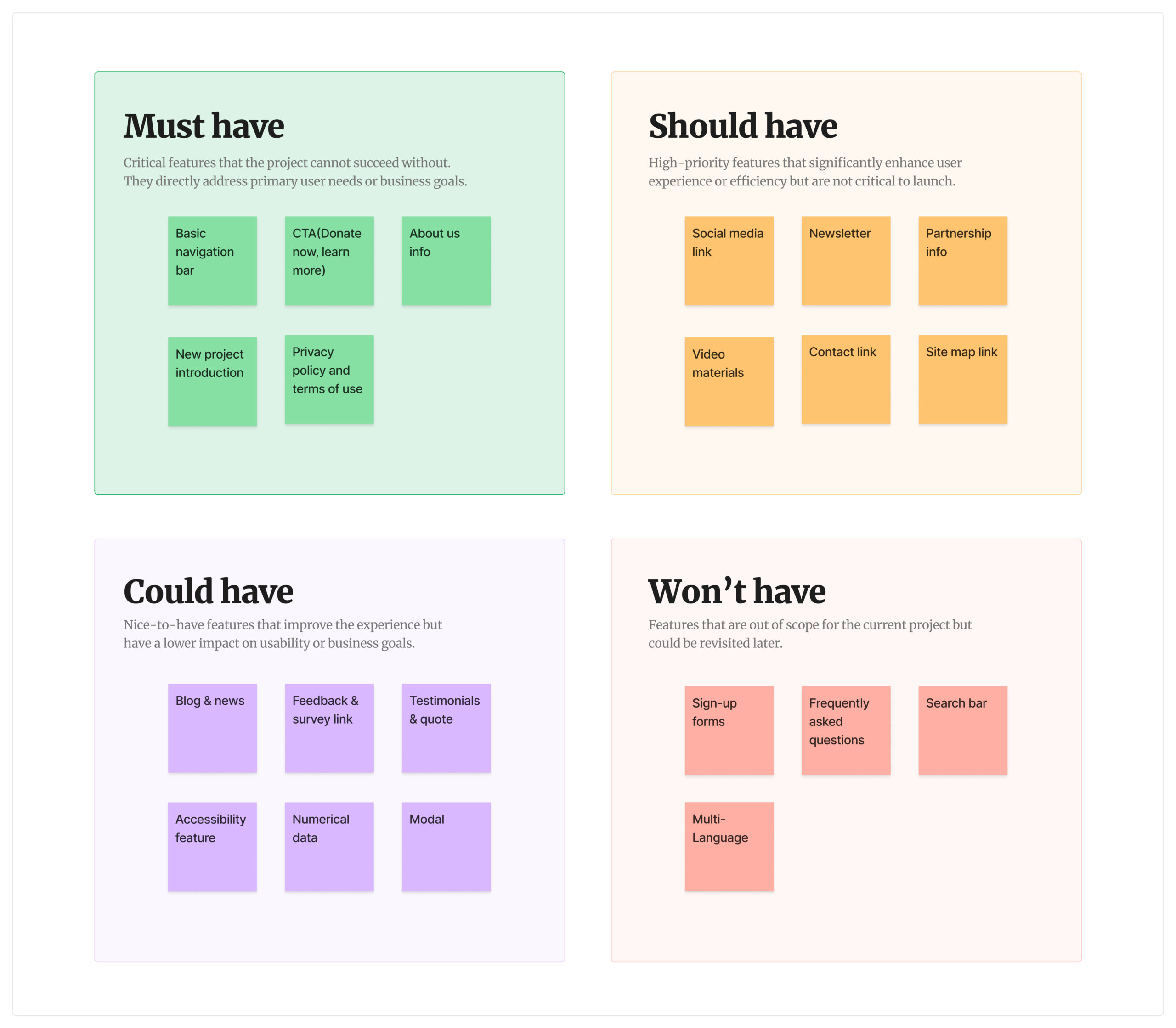
For a successful redesign process, I conducted the MOSCOW method to prioritize the features needed for the website and decide what to include and exclude along from a user-centered perspective.
Ideate
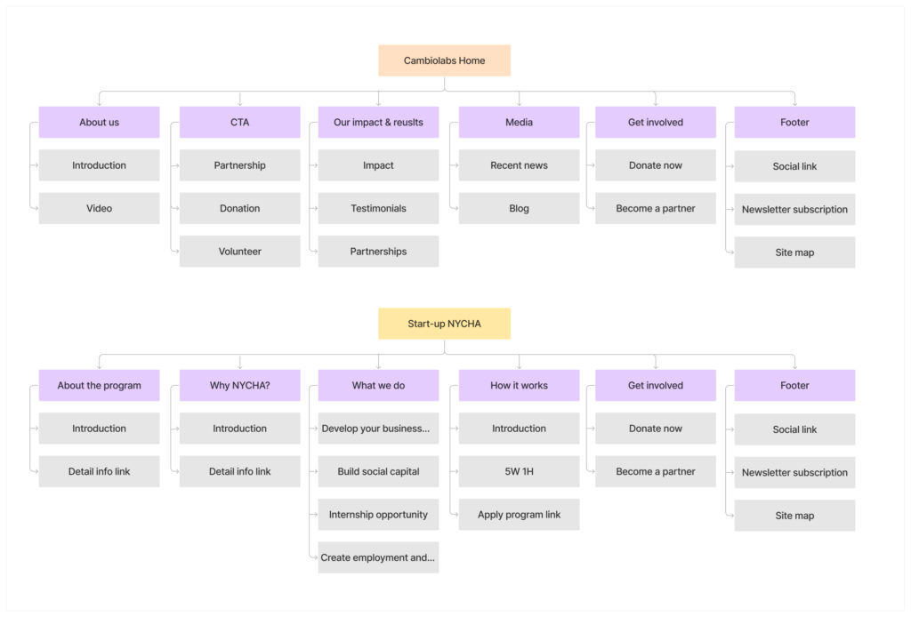
Sitemap
I created a sitemap to ensure the site’s structure, navigation, and content organization effectively.
Sitemap focuses on organizing content through visual development as well as increasing conversion rate by guiding users to complete their actions about donating and sponsoring the organization.
Design
Wireframe
I started creating the wireframe based on the information architecture I developed. Creating a low-fidelity helped me prioritize and structure content.
Design
Final design
Applying consistent brand guidelines, Cambio Labs’ final website design provides a visually appealing design experience and seamless website usability.
Design
Visuals
I created a simple UI library that simplifies the design process.

Results
Impact
While I communicated with the client this project only focused on the website visual redesign, I remain confident that it will positively impact the organization to promote their new program, Startup NYCHA with redefinged their brand guideline as well as better organized content across the website design.

Increased user engagement with appropriate CTA
A clearer call to action (CTA) helps users navigate the website and achieve their goals more efficiently.

Enhanced user experience with reorganized content
Providing better content organization across the website promotes a better user experience for users and it allows users navigate and find the information they need quickly.

Refined brand guideline
Providing refined branding and a visually appealing website design helps the organization gain immediate recognition and represent their mission and vision more effectively.
Next steps & Takeaways
What did I learn?
1. Communication is Key
This project underscored the importance of communication with client. I observed that clients are sometimes uncertain about their goals and the project scope in the initial stages. In such cases, it becomes the designer’s responsibility to propose clear directions and help clients refine their objectives through regular and effective communication. Building trust and aligning expectations early on is critical to the project’s success.
2. Iterations Through Feedback & Test
To incorporate client preferences, I presented two distinct final designs for feedback. This iterative process proved invaluable, as it saved time and ensured the project progressed efficiently. Looking ahead, with more time or resources, I would like to conduct usability tests with mock-ups to better understand user interactions and ensure the design meets usability standards.


