First Aid at Your Fingertips
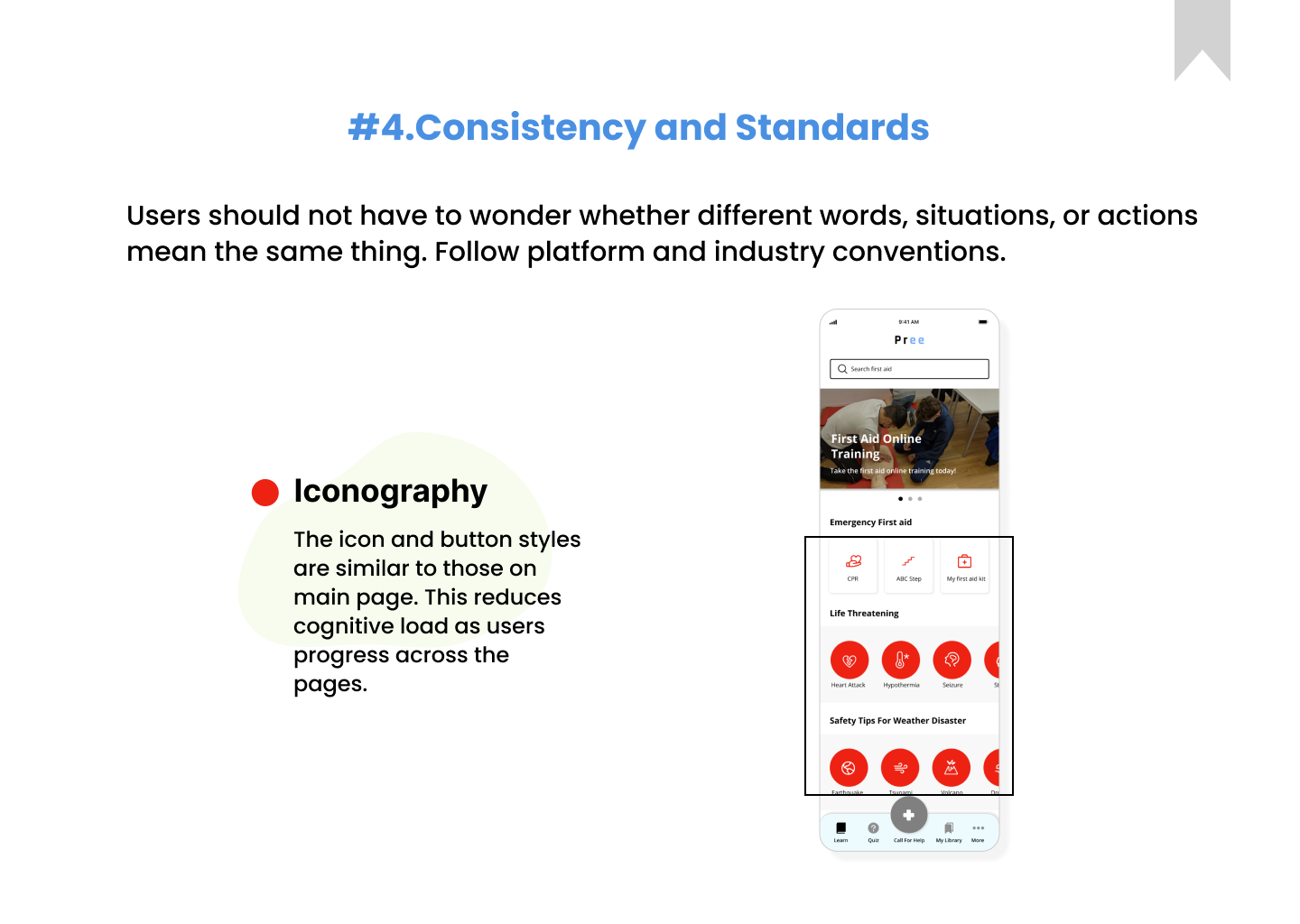
Enhancing health and wellness through better access to reactive care. Interactive first-aid education at your fingertips.
End-to-End
Data-driven design
Usability Testing
Heuristic Design Evaluation
Roles
UX Researcher, UI & UX Designer
Tools Used
Figma
FigJam
Google Forms
Google Meets
Time line
8 Weeks
Overview
What motivated me in this project?
With seven years of airline industry experience, safety was my top priority for both myself and my passengers. Maintaining first-aid knowledge was crucial, but the vast range of content and potential situations posed a significant challenge. This inspired me to create a mobile app that provides easy access to first-aid resources for first responders. Additionally, I aimed to validate my hypothesis that my product would be intuitive, useful, and enjoyable for anyone likely to encounter situations requiring first-aid knowledge.
Product
Enhancing user’s content accessibility by providing need-to-know first-aid information at their fingertips
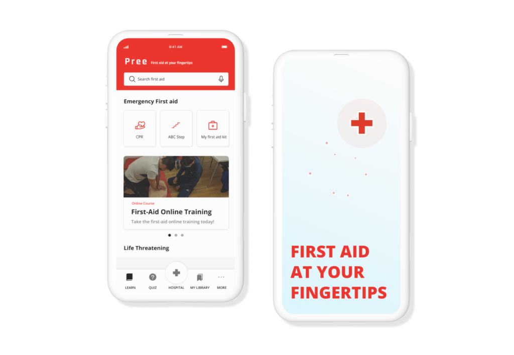
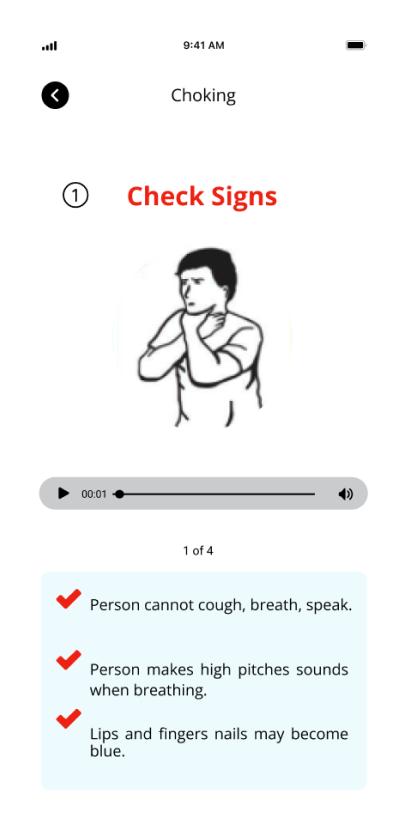
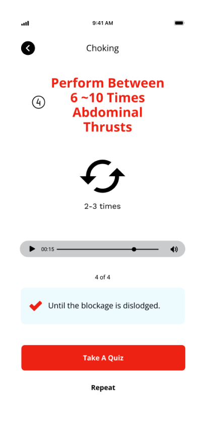
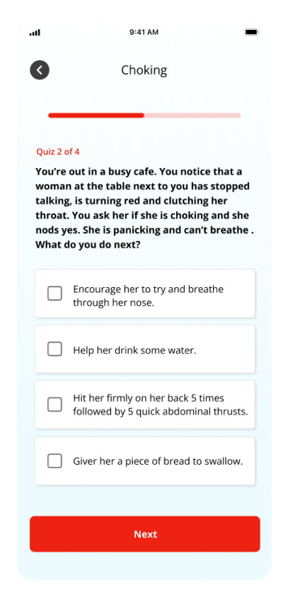
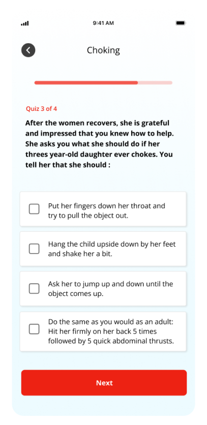
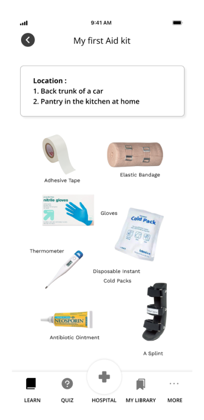
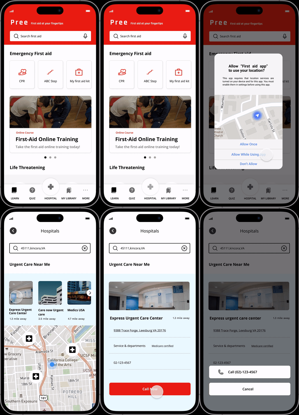
The first-aid mobile app, ‘Pree’, educates users on the fundamentals of emergency treatment using step-by-step scenarios, quizzes, and connectivity to the nearest emergency services.








Background
We never know what can happen to us or the people we love!
To prevent life-threatening injuries, it is helpful to master basic first aid knowledge. However, given the volume of information, it can be easily forgotten if we do not apply it regularly. Thus, I want to create a mobile app enabling easy and convenient access to first-aid tips to keep our skills sharp and our knowledge up to date.
Research Summary
"I understand the importance of first-aid knowledge, but I am still not sure if I am following the steps correctly."
Before conducting user interviews with six participants, I conducted market research to understand how users perceive the importance of maintaining first-aid knowledge and rate their own level of knowledge. The user survey, distributed through the design lab discord channel using a Google survey form, revealed that over 66.7% of participants recognized the significance of first-aid knowledge in their daily lives. However, more than 60% of respondents rated their first-aid knowledge as level 2 out of 5 (0: Poor, 1: Ok, 2: Good, 3: Excellent, 4: Best imaginable).
Competitive Analysis
What are competitors doing?
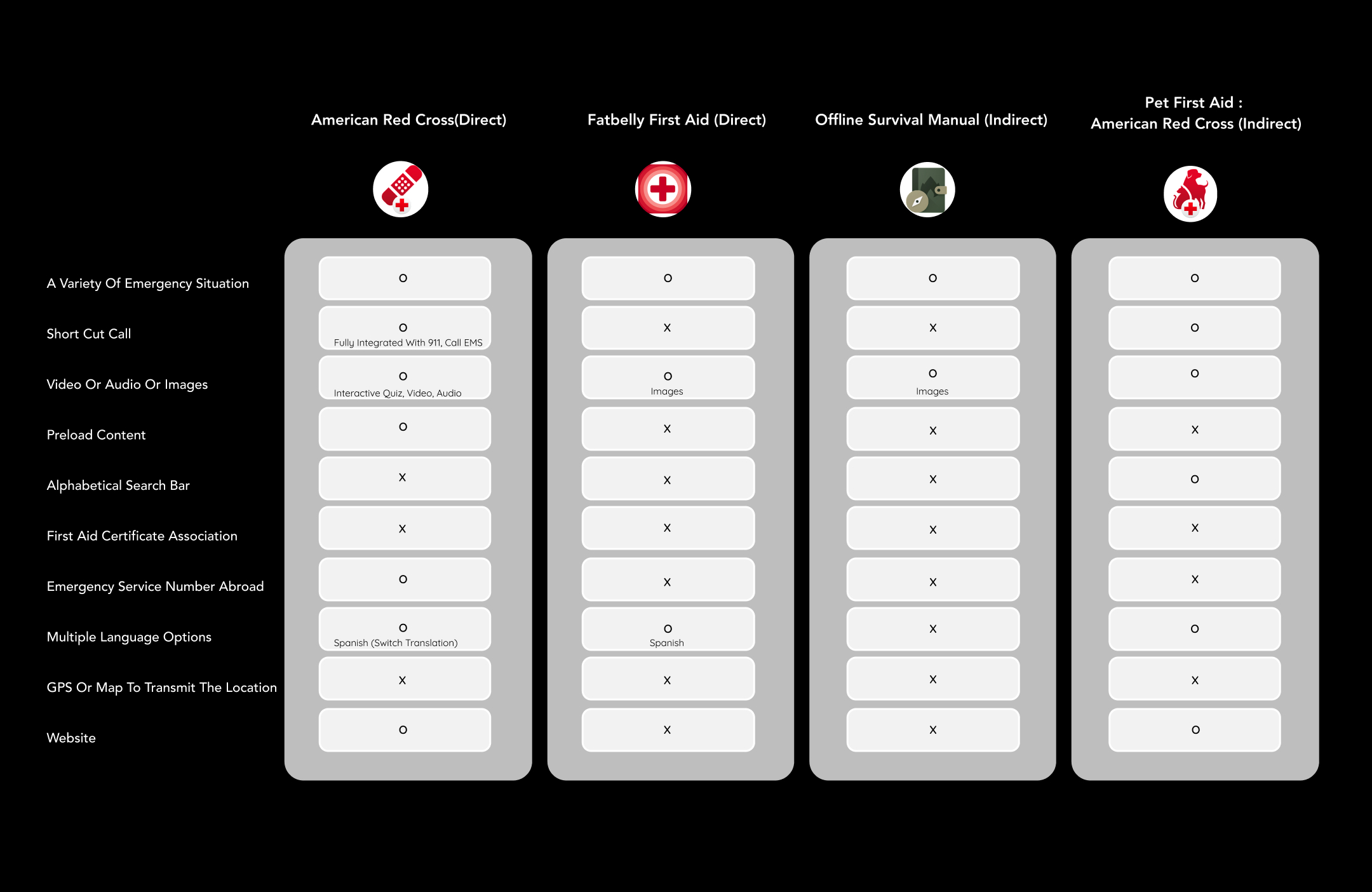
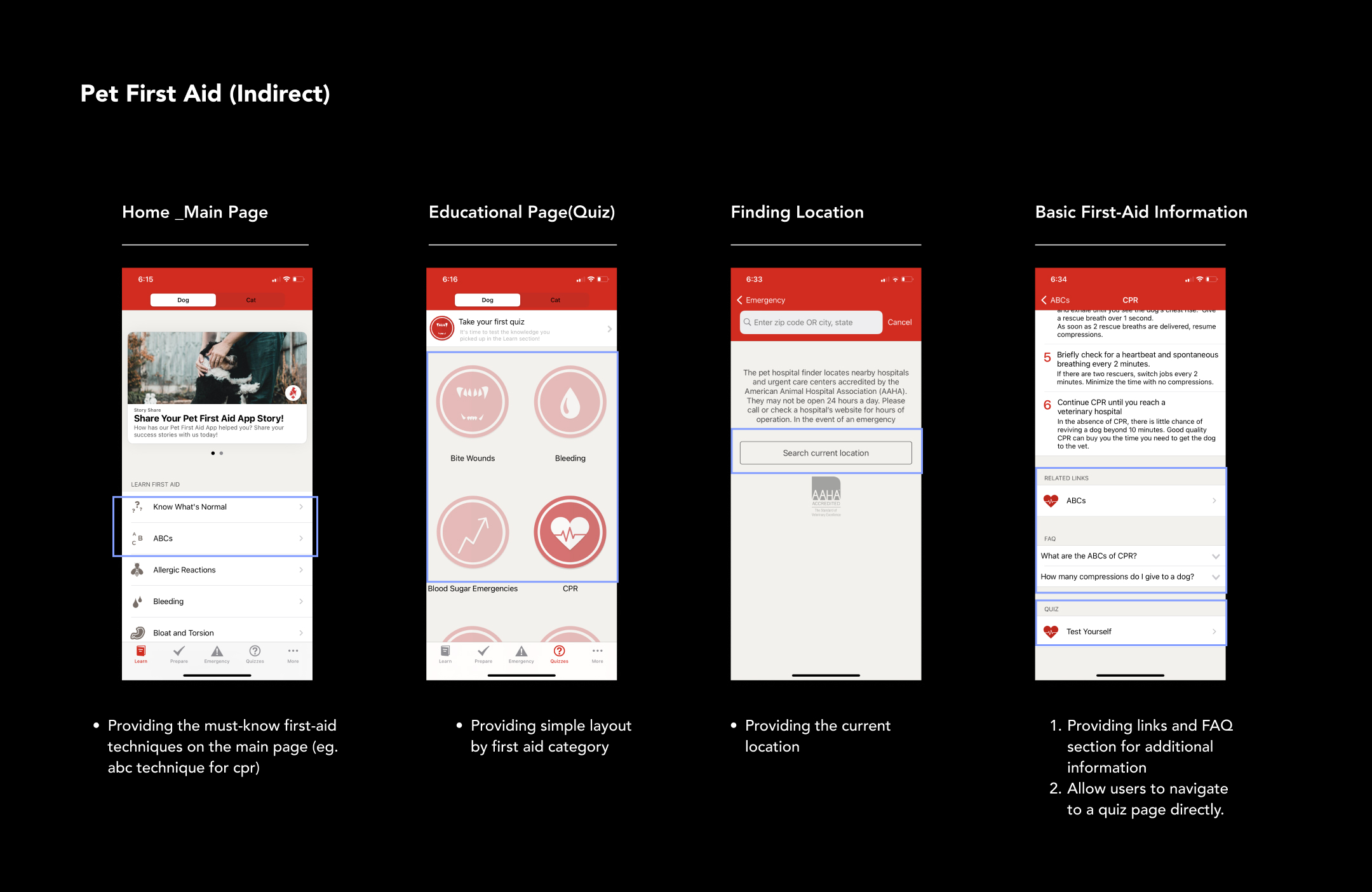
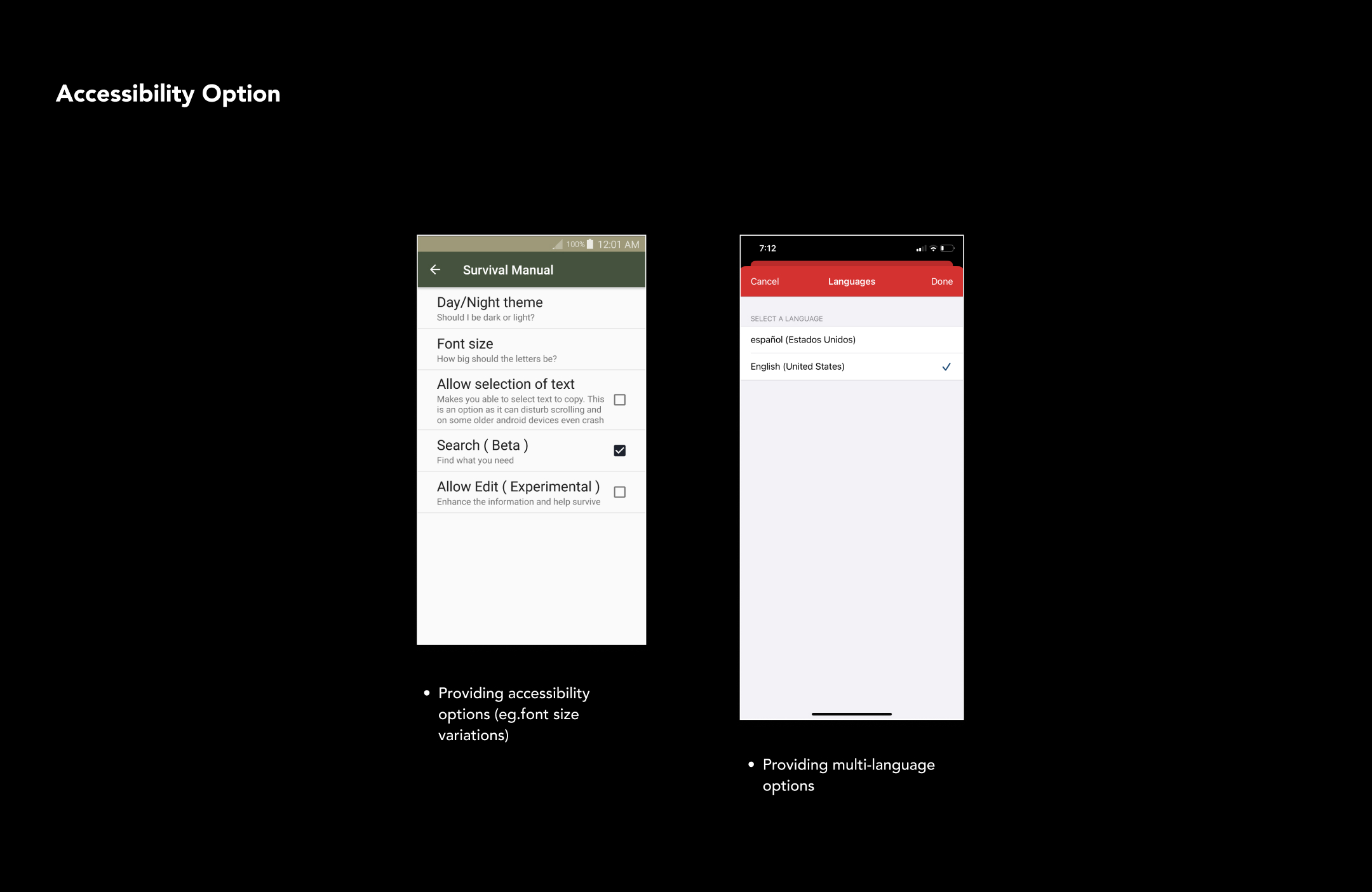
I completed a competitive analysis in two stages. The first is understanding what competitors are offering in the market and finding a niche for my product. The second stage focuses on understanding the layout and content hierarchy within the first aid app mobile design based on the MVPs competitors are offering.
Research Key findings
What did I find?
Frequency
More than 50% of respondents indicated that they have encountered a situation that required first-aid in the past.
Home & Outdoor
The places/situations in which first-aid is most often required include ‘home’ and ‘outdoor activities’.
Uncertainty of Real-World Situations
Over 80 % of survey takers responded, ‘uncertainty about whether their application of first-aid procedures is correct ’ is the biggest challenge in a real-world situation.
Precise Information
More than 77.8% of respondents prioritize ‘Precise first-aid information’ through the first -aid mobile app.
Goal
Create a first-aid mobile app that increases individuals' confidence in applying first-aid procedures in the real world.
I want to design a first-aid mobile app that helps people expand their first-aid knowledge on a regular basis so they can be confident in applying first-aid procedures in a real-world situations.
Key Feature 1
Intuitive Main Navigation
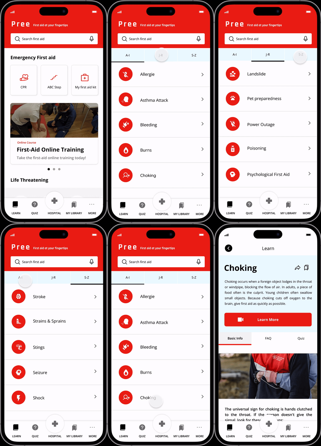
Users can quickly search for first-aid information by horizontal scrolling on the main page. It is designed with simplified icons and accent colors.
It enhances product accessibility for anyone who needs first-aid information at their fingertips.

Key Feature 2
Alphabetical Search Bar
Users can quickly and easily search any number of first-aid terminology through the app as they are listed alphabetically.
It reduces the burden of users from having to search through numerous first aid topics.
Key Feature 3
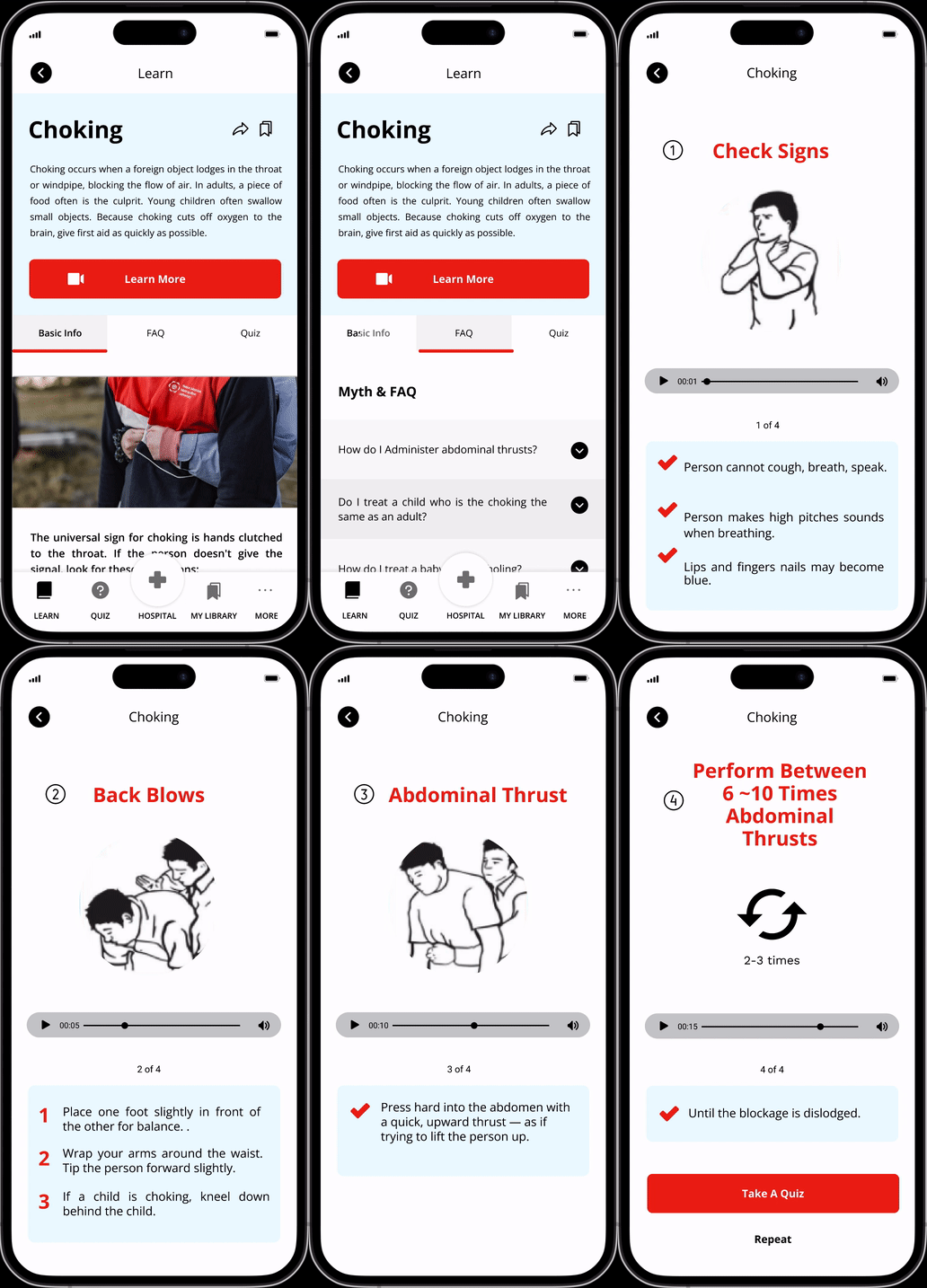
Easy to Follow 'Step-by-Step' Scenarios
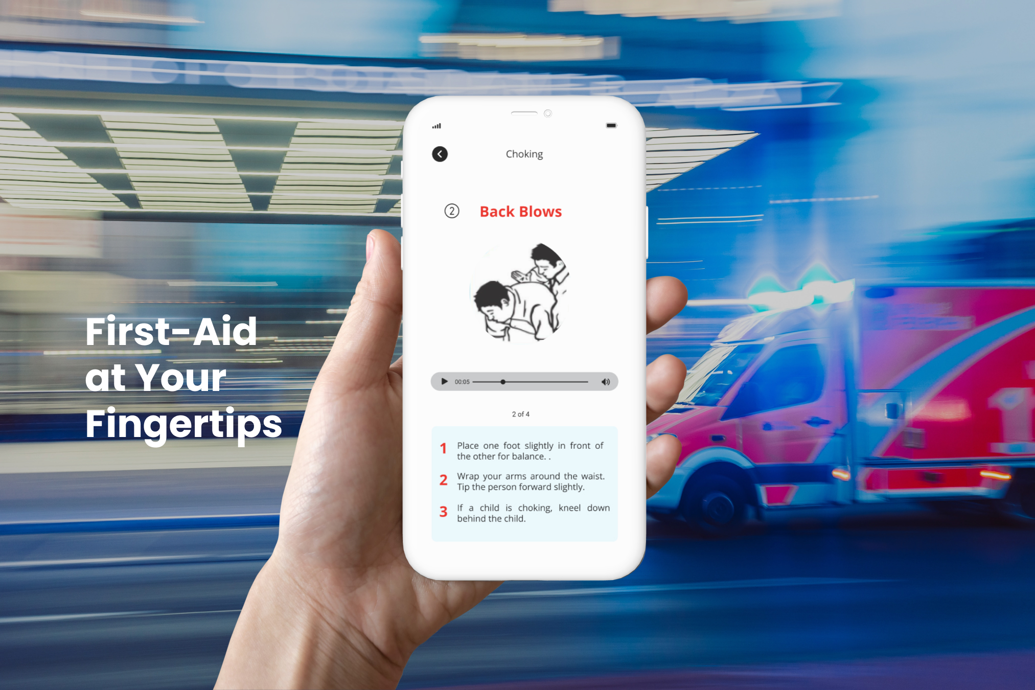
The app provides a visual and audio walkthrough of possible first-aid scenarios to give users confidence should they encounter similar situations in real-life.
It increases users’ understanding of complicated first-aid procedures.
Key Feature 4
First-Aid Quiz
The first-aid quiz refreshes your first-aid knowledge on a regular basis.
It prevents users from being influenced by misconceptions about how to apply first-aid.

Key Feature 5
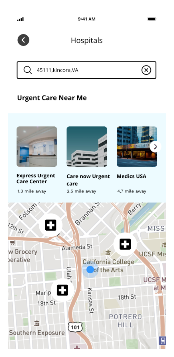
Direct Emergency Call
The mobile app has direct emergency call functionality which locates and calls the nearest hospital to the user.
It Increases mobile app usability by providing direct user engagement.
Usability test
Test, Evaluate, Iterate
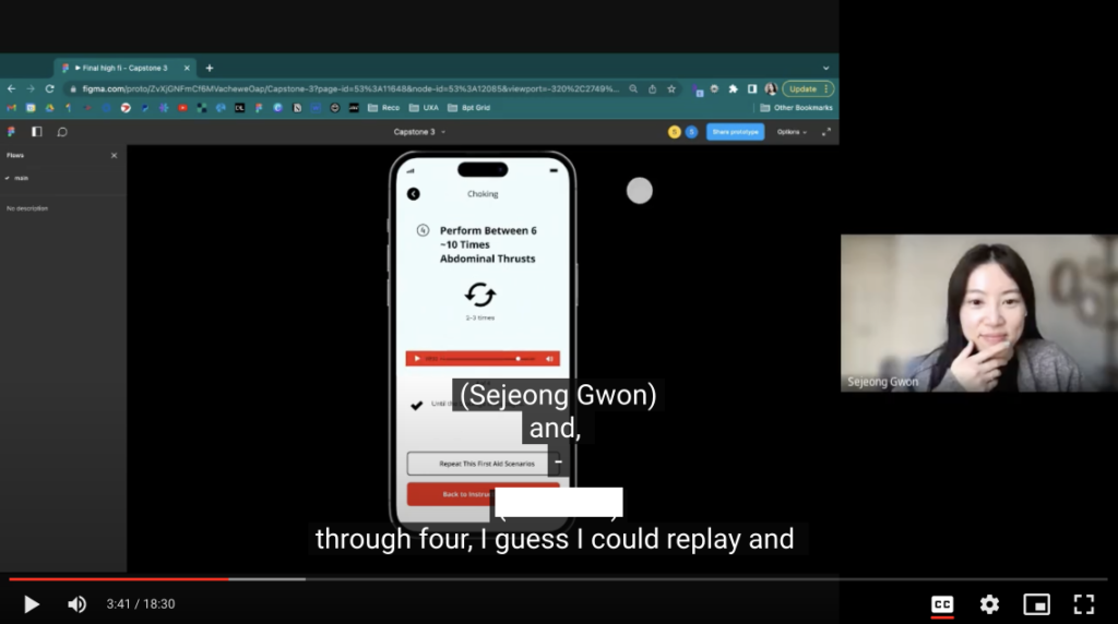
To test and evaluate my design, I conducted a usability test on six participants using the unmoderated test method. Participants were given five tasks and completed the task within the Figma prototype. At the end, participants were asked the SUS(system usability scale) questions related to the level of ease to use, usefulness, engagement, and recommendation on a scale of 1-10.
Usability test key findings
KPI SUS(System usability scale)
Easy to Use 8/10
- Participants agreed that this first-aid mobile app was easy to use, with an average score of 8 out of 10.
Useful 8.8/10
- Participants agreed that this first-aid mobile app is useful, with an average score of 8.8 out of 10.
User Engagement 8.5/10
- Participants agreed this first-aid mobile app helps increase user engagement to obtain first-aid skills, with an average score of 8.5 out of 10.
Recommendation 9.5/10
- Participants agreed that they would recommend this mobile app to family or friends with an average score of 9.5 out of 10.
Define
Develop a use case that articulates the persona's goals and motivations.
To understand users’ behavior when interacting with my product, I created 2 provisional personas, each with its own goals and motivations. Then, I developed 2 use cases that answer directly to the needs of these 2 initial persona groups.


First Responders



Casual Users
Design
UI Library Kit
Based on my mood board, I opted for red and light blue as the primary colors in my design. These two accent colors are paired with a white background to make the app appear purposeful without being overwhelming. Finally, the name of my product, ‘Pree’ is derived from the words “prepared”, “preloaded,” and “preventative”.
Design
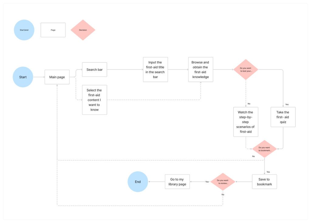
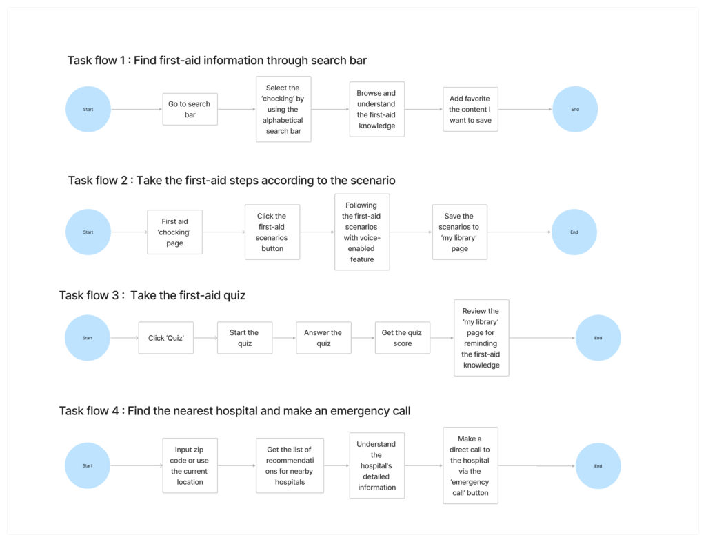
User & Task Flows
Four primary task flows will be taken by my target users within the product. Based on the insights from the ‘Define’ design process, I determined both first responders and casual users prioritize educating and refreshing first aid knowledge. with that in mind, I created task flow 2 and 3 as the essential flows that both my target group should take for completing their goals. Task flow 4 is usually happening for casual users who want to use the first-aid mobile app for practical purposes in daily life. Finally, task flow 1 was created to give users control over the search of the first aid information process.
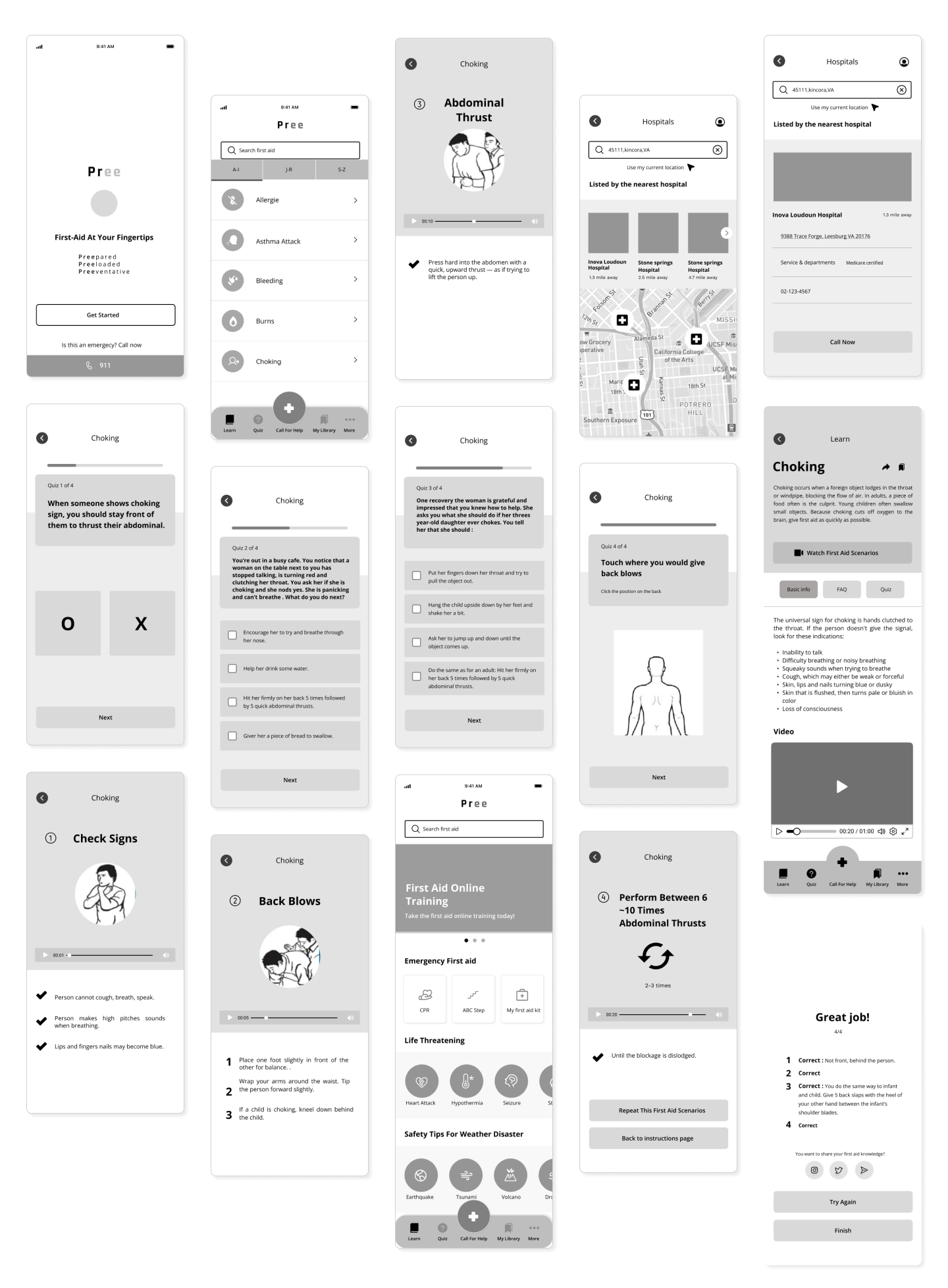
Wireframe
Prioritize content with usability, functionality, and user behaviors in mind.
To find the best layout options for my First-Aid mobile app, I first started sketching. It helped me learn how to organize content in a hierarchical fashion.
Afterwords, I narrowed down the low wireframe decision to move on to digital wireframe creation.
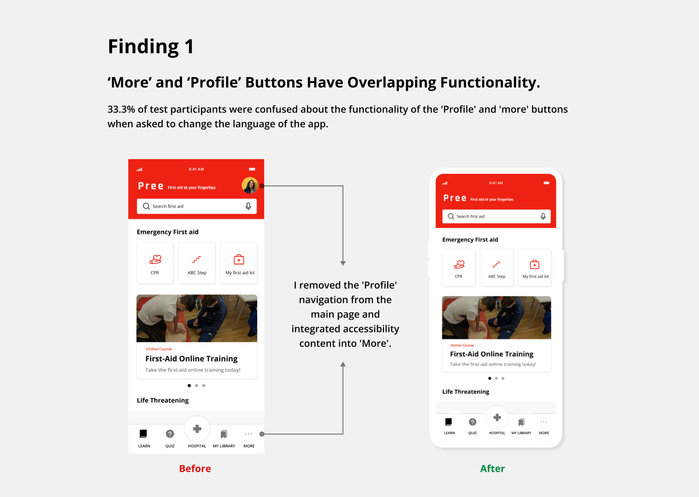
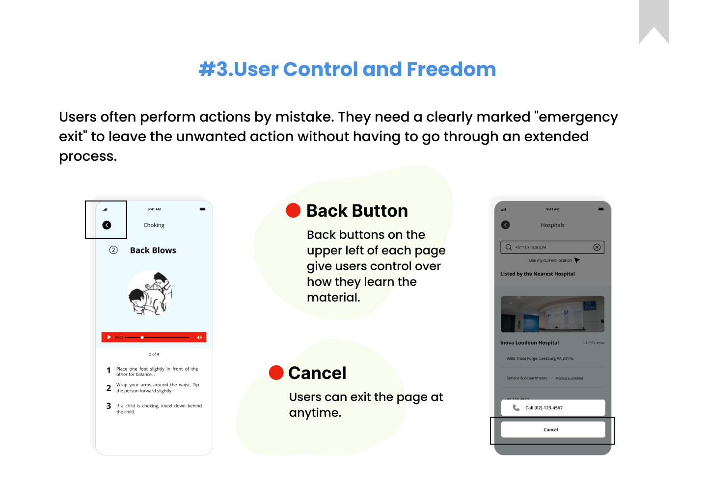
Heuristic Evaluations
Optimize my design decisions
Heuristic evaluations allowed me to optimize the usability of my product by analyzing and minimizing the deficiency of my design decisions.
Final Mockup
Takeaways
What did I learn?
1. Quantitative user survey
This project provided an opportunity to learn how to implement a key performance indicator (KPI) method to quantitatively measure usability test results.
2. Accessibility
For the next steps, I would like to undertake an in-depth research process to make my product more accessible and more compliant with WCAG guidelines.
3. Familiarize me with the design hand-off process to have a deeper understanding of the holistic design process in UX.
As I was in charge of this project from research through conception and completion of the end-to-end design process, I realized that understanding holistic real-world work processes is very crucial. As a product designer who prioritizes the importance of communication along the way of creating products, I would like to have a deeper understanding of how I communicate my designs to engineers and how the UX process works in real-world situations.

