
Responsive Design
Visual design
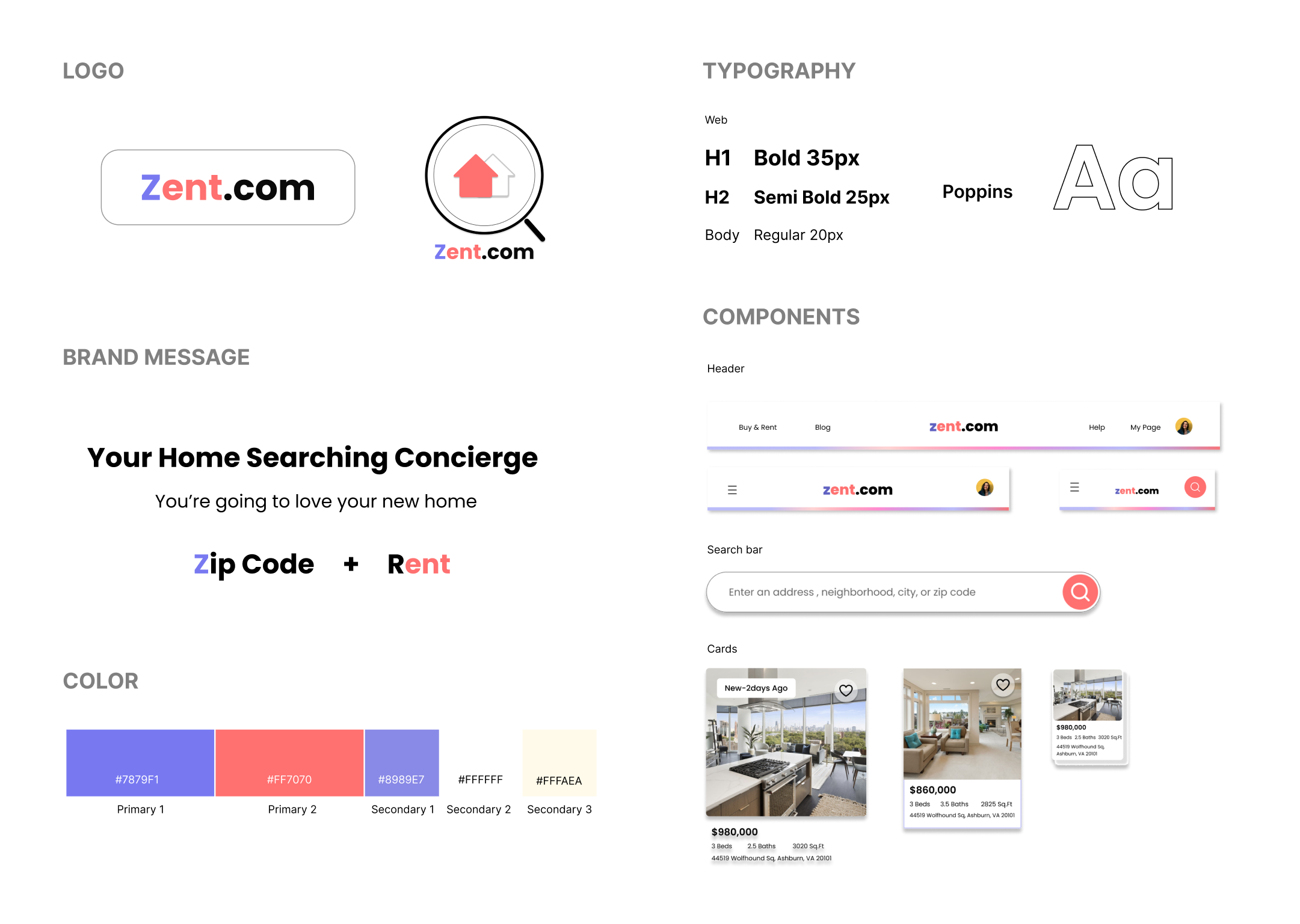
Branding
Real-Estate
Roles
UX Researcher,
UI & UX Designer
Tools Used
Figma
FigJam
Google Forms
Optimal- Workshop
Time line
80 hours

Product
Zent.com is a real estate search platform that helps prospective renters and buyers match their new homes. We provide personalized filtering functionality and an easy-to-follow virtual home tour request process.
Background
Home buying has historically been highly competitive and time-sensitive in nature. This requires real-estate platforms with a high degree of user-centric and responsive design.
Problem
So what hinders users from finding the right home?
Modern users face multiple challenges in their home-buying journey, from understanding the market, having access to information, negotiating with the seller, and competing against other prospective homeowners. A key component to successfully obtaining a property is having easy access to the accurate property, pricing, and scheduling information.
Goal
User-centric responsive design
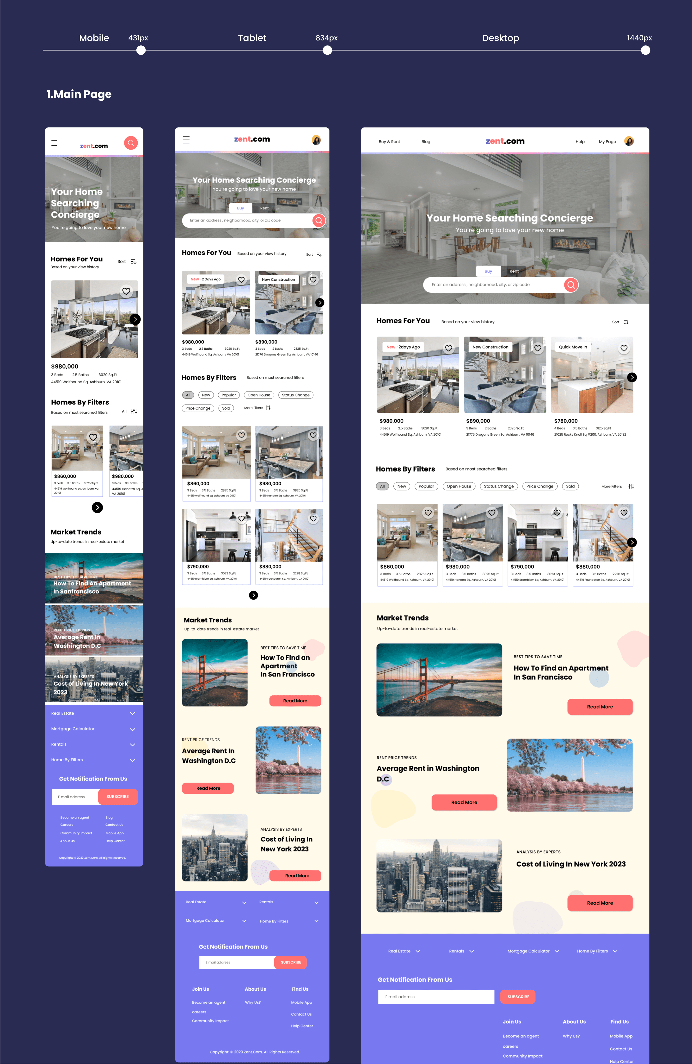
I propose a real-estate platform that provides a seamless experience across multiple mediums (website, tablet, smartphone). This product will empower users with the information they need during their home search, regardless of where they are and what device they have access to.
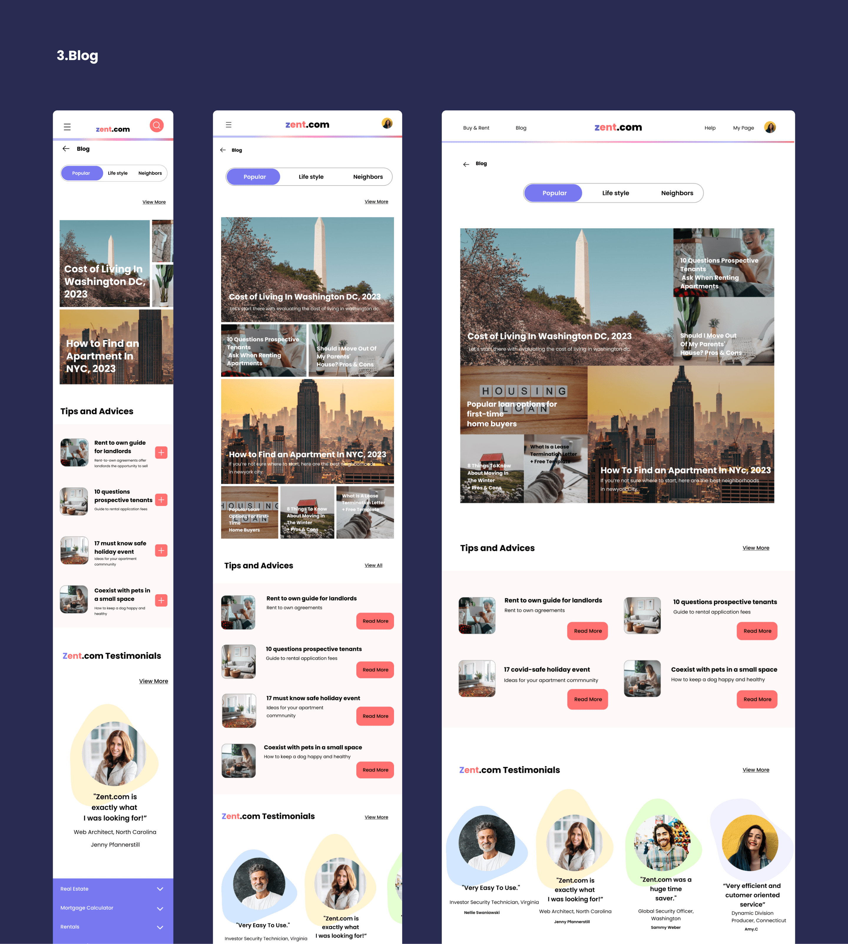
Key UI design
How did I approach the design process?
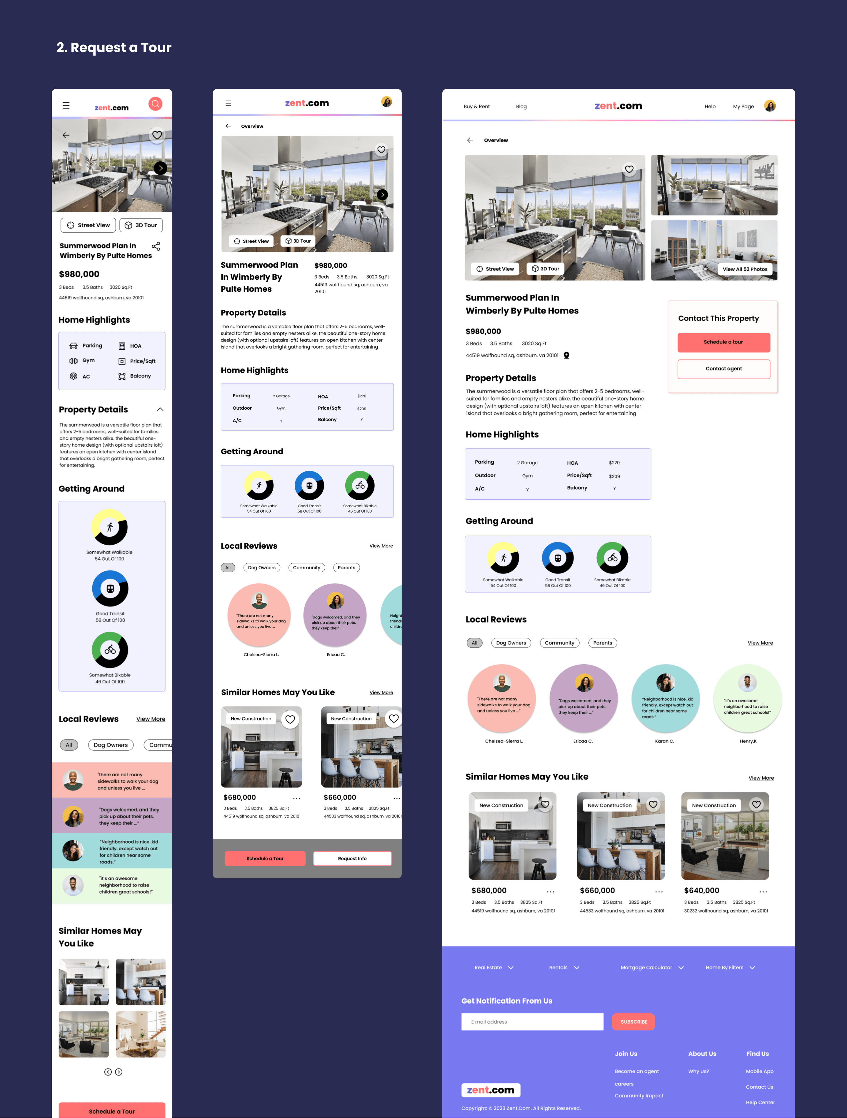
I focused on designing variations of a user interface (UI) tailored to different viewport sizes (mobile, tablet, and desktop).
Research
What is responsive web design?
'Responsive mobile websites are websites that can accommodate different screen sizes. Essentially, a responsive website is a customized version of a regular website that is optimized for mobile.'
Responsive website design is essential to serve a diverse range of users in the real-estate market. In order to bring the design to fruition, I need to first understand the difficulties that users encounter during the search process. Creating a responsive design is crucial for boosting business metrics (i.e., sales/conversion rate) because it allows the product/service to reach customers through more than one medium.
Research Goal
What should I focus on?
One of my objectives is to identify how different users interact with a real estate website and its mobile variant. I would also like to identify the unique challenges users face with each medium.
I conducted interviews with 6 participants. User interviews targeted potential tenants who were living alone. The sample participants were chosen regardless of current location or employment.
[Key Findings]
- Overwhelming quantify of property information
- Platforms that were seller/owner-centric
- Shortage of reliable information (prevalence of online scams)
- Users prioritized high-resolution property images and 3D tour features, reflecting the shift in work schedules and lifestyle
Based on the above findings, my designs should aim to be more tenant/buyer centric, focusing on the needs of the renter/buyer.
I conducted the survey through a Google online with 8 participants living in across both metropolitan areas and suburbs. The 5-10 minute survey was conducted over 2 days and respondents were mainly asked about their experience with their home-searching process through real-estate websites. I focused primarily on their goals and challenges during the process.
[Survey Key Findings]
- 30% of respondents prioritized a variety of filter options in the mobile home-searching
app - 37% of respondents visited a local community website to acquire the information
relevant to a prospective home - 10% of respondents are concerned about fraud during the home-search process
- An equivalent proportion (50/50) of respondents preferred to look for homes via web and app
[Survey Outcome]
I have learned how to conduct primary mixed methods (quantitative & qualitative) research toidentify the challenges and goals that prospective home buyers/renters face when interacting with digital real-estate platforms.
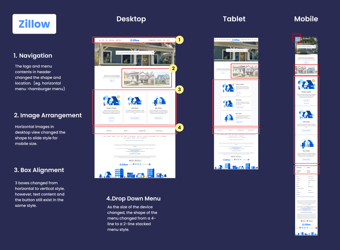
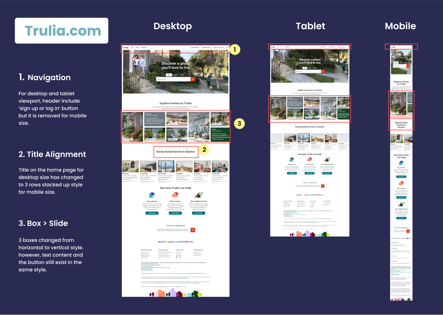
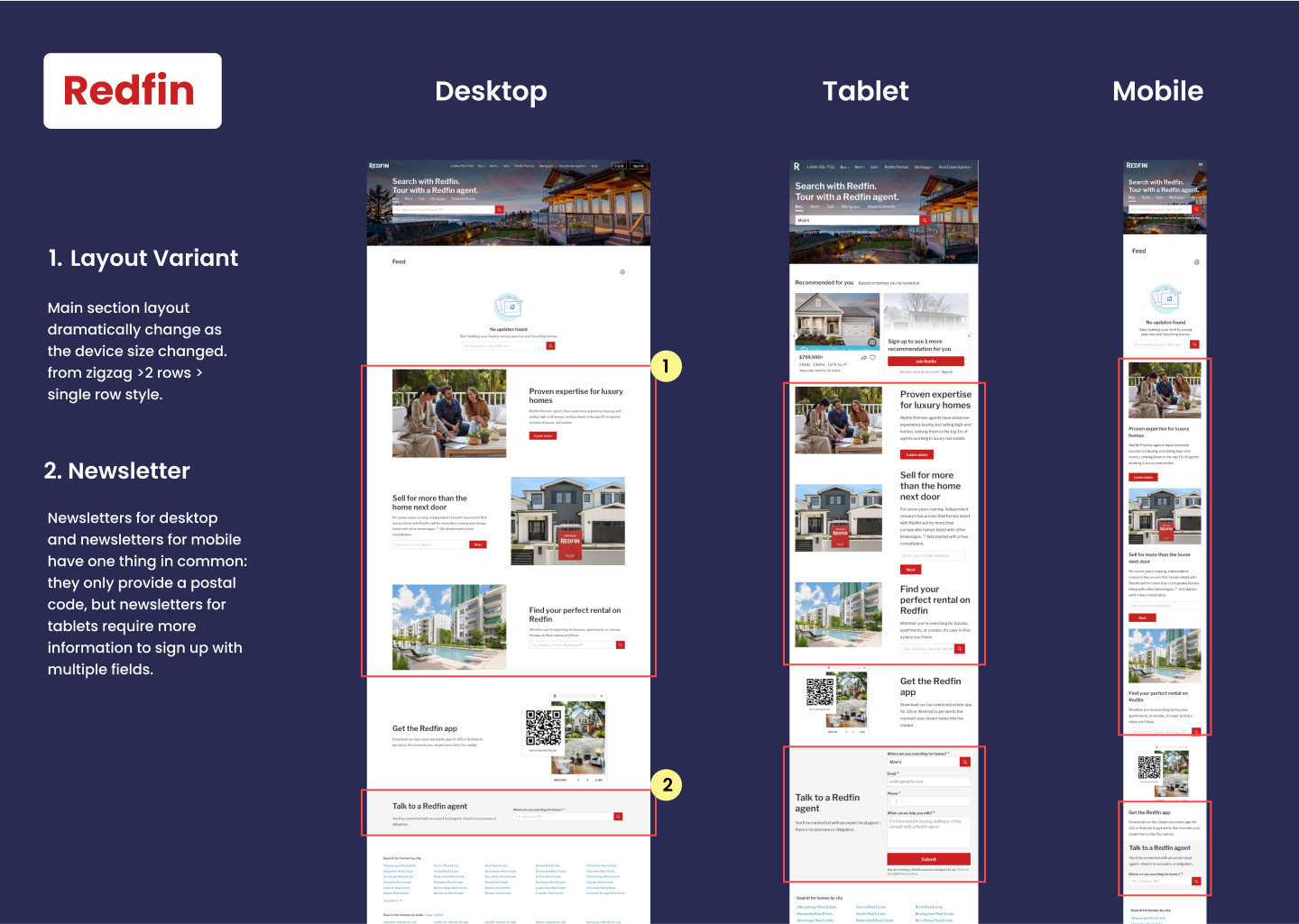
The competitive analysis was conducted in three stages.
- The first stage entailed a general analysis of how competitors position themselves in the market
- The second stage focused on identifying my product’s value proposition
- The third stage identified how competitors apply responsive web design (i.e., how they designed and implemented variations of their website on various devices)
This process helped me formulate design decisions for my own responsive web design.
[Key Findings]
-The usage of the real-estate website is varied based on the user’s different situations
Mobile users :Quick filters for casual property search
Tablet users : Prioritize a more in-depth view of properties and selling agent information
Desktop users : Want the ability to access high quality pictures and scheduling a home tour
Research Key insights
What are the pain points?
01.
Too Much Data
There is too much information online which may overwhelm home searchers.
02.
Landlord Centric Market
Most home-renting websites and apps are tailored for landlords.
03.
Contact-Free Social Phenomenon Induced by Pandemic
Due to the lifestyle changes caused by the pandemic, tenants are reluctant to interact directly with the owner.
04.
Personal Demand Diversification
The interests and demands of customers are becoming more diversified with the work-from-home culture.
Solutions
Easy to Follow Navigation
A well-organized UI by category and group is essential.
One on One Virtual Video Meeting
More virtual home tours and contactless home rental procedures are needed.
Personalized Page
Pages with personalization can be designed with tenants in mind.
Filtering
Home filter options are needed for personalized searches.
Competitive analysis
What are competitors doing?
I analyzed how competitors have approached the responsive design process, what I can learn from them, and how to apply these rules to make my website design more usable.
Competitive Analysis Insights
Space -Saving
Options are aggregated under the hamburger menu on the mobile platform.
Efficiency
Efficient menu orientation should be applied to accommodate variable screen size.
Consistency
Text, buttons, and images maintain a consistent style across platforms.
Define & Ideate
Who are my target users?
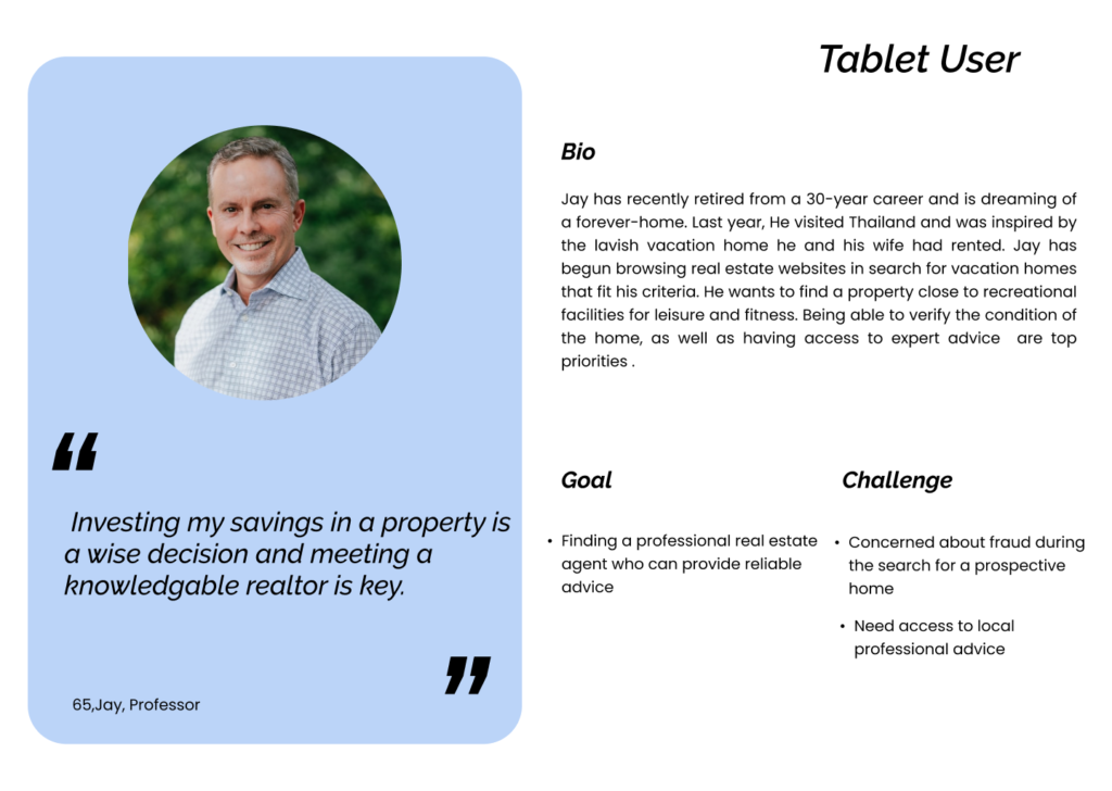
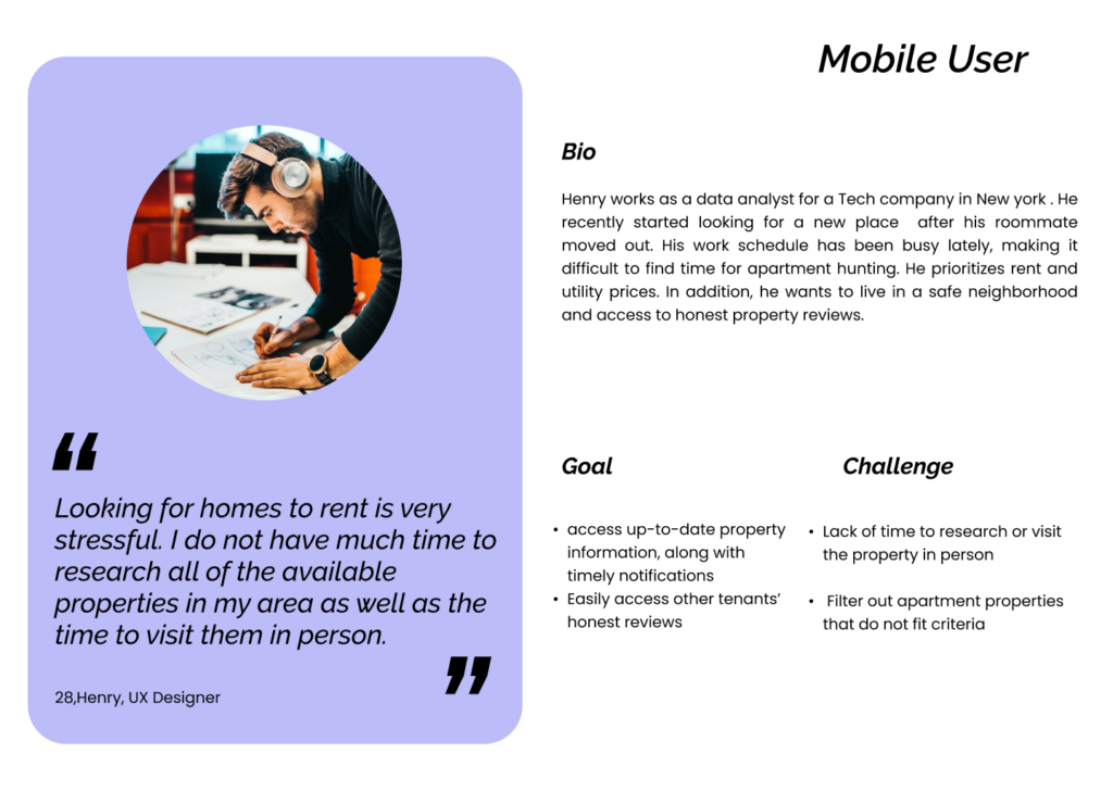
I created three personas based on different platforms (desktop, tablet, and mobile).

Information architecture
Lets organize, structure, and label content in a sustainable way.
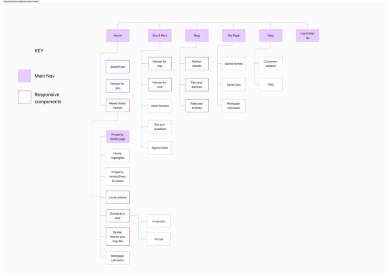
Based on the card sorting results, I created the information architecture for the responsive website. It includes 3 basic navigations: ‘main page’, ‘request a tour’, and ‘blog’. Users also wanted to have their own page to check tour status and preferred housing candidates, as such, ‘My Page’ was added as another primary navigation in the real estate website structure.
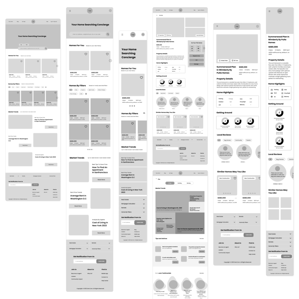
Wireframe
Prioritize content with usability, functionality, and user behaviors in mind.
First, I used the sketch method to find the appropriate layout solutions for the web, tablet, and mobile. Then, I used the ‘grid’ to bring consistency across the different screen sizes and began digitizing my work based on the user and task flows.
Usability testing
Evaluating my product by testing with representative users
Users were given the main task ( Request a tour) with 3 different prototype versions. I observed the user’s interaction with the prototype, and test the usability, and functionality of my design.
Before

After
Finding 1
Personal Page
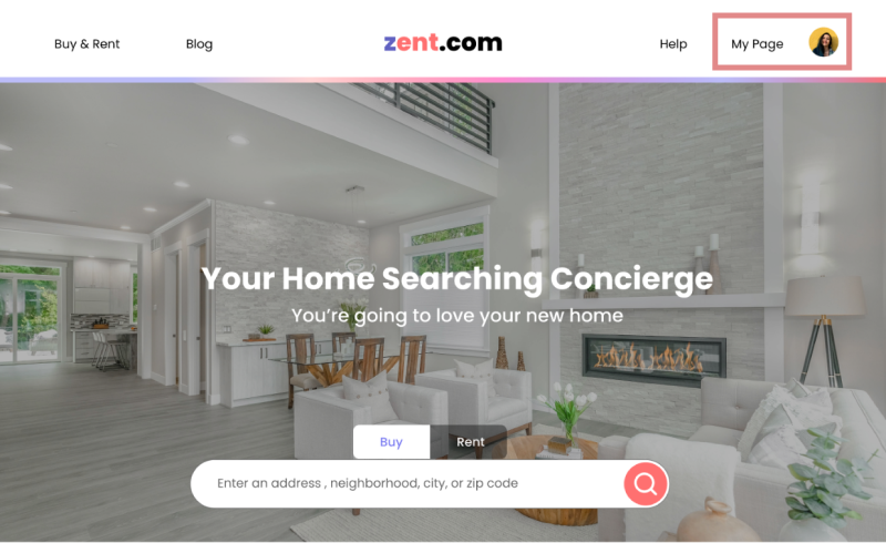
Users expected to find the ‘My Page’ section near the log-in/out button. This meant that users perceive the ‘My Page’ as a secondary menu in the navigation bar.
I relocated the ‘My Page’ menu for primary navigation and grouped it with ‘Help’ and ‘Profile’.
Before
After

Finding 2
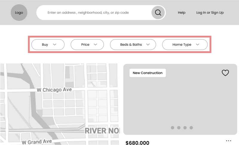
Filters
The filter options were not detailed enough for different users’ needs. I have added the ‘More’ category to reflect different user preferences.
Before
After

Finding 3
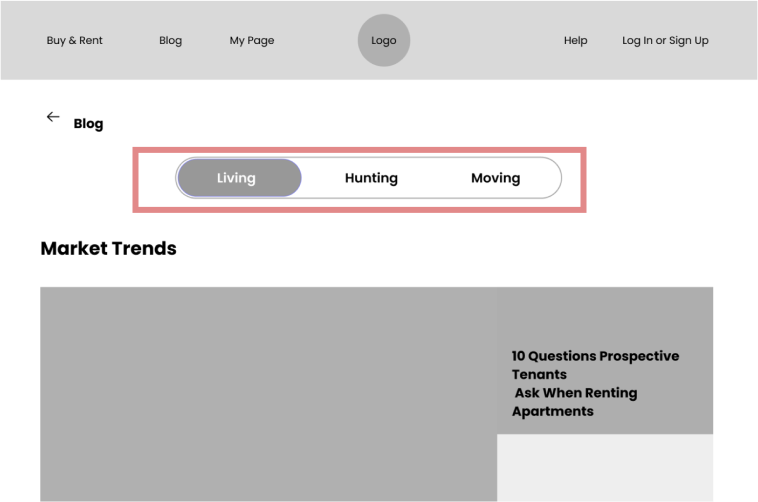
Unclear title
Thirty-three percent of users were confused about the meaning of the titles in the blog section.
I changed the title that aligns with users’ needs more effectively.
Final thought
Key takeaways and what's next?
This project was giving me a chance to learn and study more about how responsive design is used in mobile website design and how to approach this project, unlike other UX design case studies. Also, we are living in an era where it is becoming common among users to use different types of digital media in different contexts, providing inclusive design across the digital platform as a UX designer is essential not an option.
Due to 80 hours time limit, I was not able to take the usability test with as many as users but I gained enough insights about how users interact with mobile, tablet, and website of real-estate website design differently and what are their goals and motivation that I need to focus for improving the design. For the next steps, I would like to understand what the criteria are for conducting usability tests more effectively and how to improve my design with that approach.
